
eCommerce website Best Practices
Summarize with
In a hurry? Get Headless CMS
If you are in the business of selling tangible products, you’ve probably already joined the eCommerce bandwagon.
According to eMarketer, eCommerce sales will reach nearly $2.5 trillion by 2018. Bricks and mortar store owners are increasingly joining the digital race to boost their earnings.
And why shouldn’t they?
The internet is a shopper’s paradise. From the comfort of the home and with one click, a consumer can purchase almost anything they desire, without the hassle of fighting traffic, finding parking, braving the crowds and coping with adverse weather.
So where does that place you?
In an increasingly overcrowded eCommerce world against your fellow online vendors.
To beat the curve and join the ranks of the high-flying eCommerce stores, you need to provide consumers with a well-organized and efficient online shopping experience.
The notion of a perfect eCommerce site is a myth, but you can create your own version of perfect by constantly running A/B tests and always thinking about your customers and their needs.
Great eCommerce sites have several elements in common.
On this page:
Download our checklist: eCommerce website design Leading practices
Homepage leading practice tip #1: An ever-present search bar
The following elements are integral to a high converting homepage:
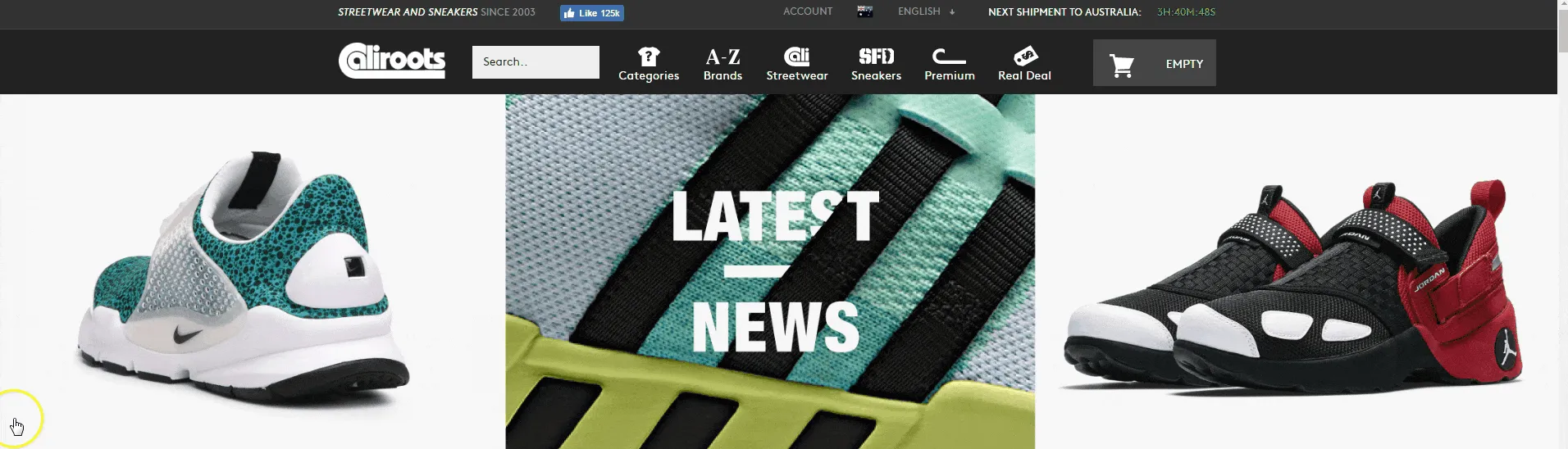
A search bar is an incredibly important part of any eCommerce website. Make sure that when the consumer scrolls down to look at the bottom of the page, the search bar squeezes into the navigation bar and scrolls down with them. Visitors shouldn’t need to scroll back up the page just to search for something new.
Read this next:
What Is Elasticsearch? The Hidden Power Behind Search
Homepage leading practice tip #2: Value proposition front and center
Your homepage needs to have a strong hook in place to excite consumers and encourage them to shop. Add oomph to your value proposition by stating the benefits of your products in a concise way. State your USP and reflect your brand personality via this. Make sure your value proposition is clear and visible.
Homepage leading practice tip #3: Sales products tab/promotions tab
Keep existing customers and those new to your website updated with your latest promotions. You can display a tab at the top of the page with details about your latest discounts and offers. It’s also a great place to display incentives for first-time shoppers.
Homepage leading practice tip #4: A footer where customers can find info about your company
Add all your business details in the footer of your eCommerce website. Add a brief description of your company, email address or a toll-free number they can reach you on, your location, different product categories, a blog (if you have one), your social media accounts and so on.
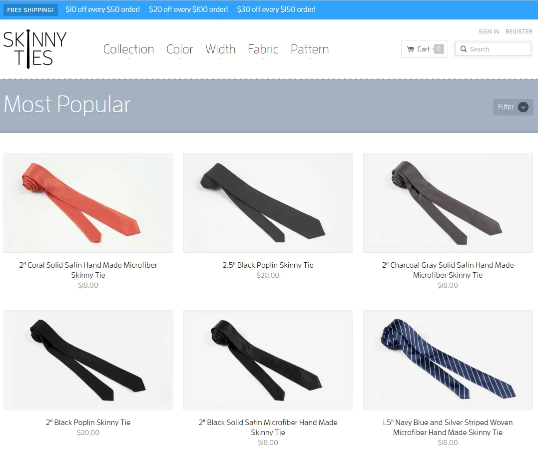
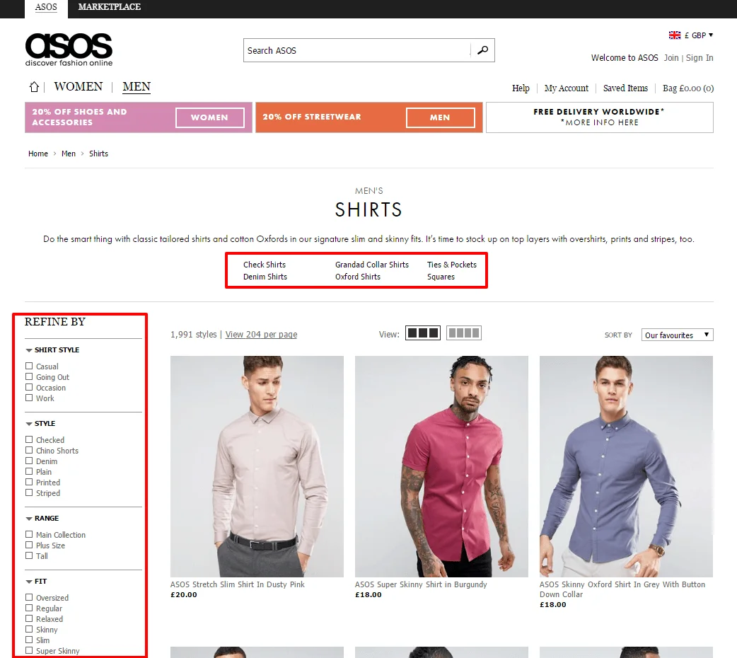
Category page leading practice tip #5: Clearly displayed products in rows
Category pages need to have the following elements to reap lucrative rewards:
Category page leading practice tip #6: Easy-to-find navigation
According to Barbara E. Kahn, professor of marketing and director of the Jay. H. Baker Retailing Center,
“The notion is you will take one product when goods are stacked vertically and more than one when they are stacked horizontally. Retailers have figured this out.”
This shows that products stacked horizontally in rows will sell better compared to products displayed in columns.
Category page leading practice tip #7: Feature banner to highlight promotions
Having a clear navigation plan assists in usability and allows users to hop on to their desired category with ease.
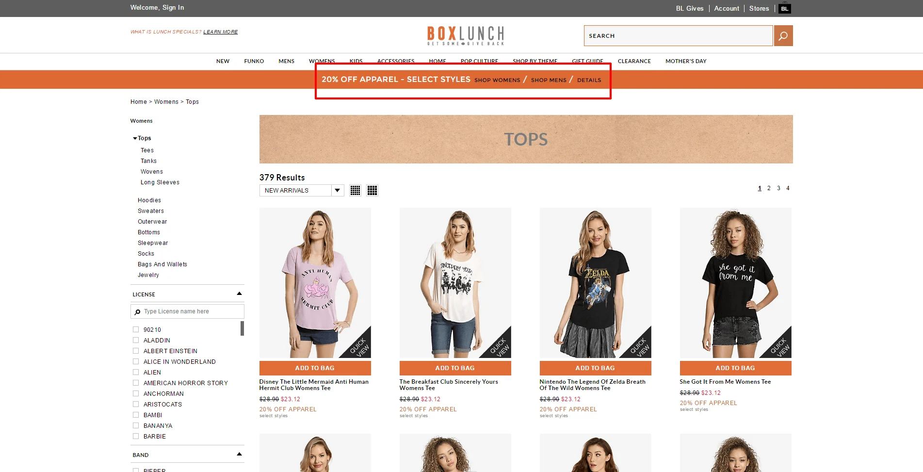
Feature banner is a vital part of a category page. It improves user experience in a number of ways – showing them that they’re on the right page, nudging them towards the next step they need to take to complete their online shopping process, and tempting them with constant promotions.
What to ask your eCommerce CMS vendor
Category page leading practice tip #8: Dedicate a section to “Greatest Sellers” and/or “New Arrivals”
Category page leading practice tip #8: Dedicate a section to “Greatest Sellers” and/or “New Arrivals”
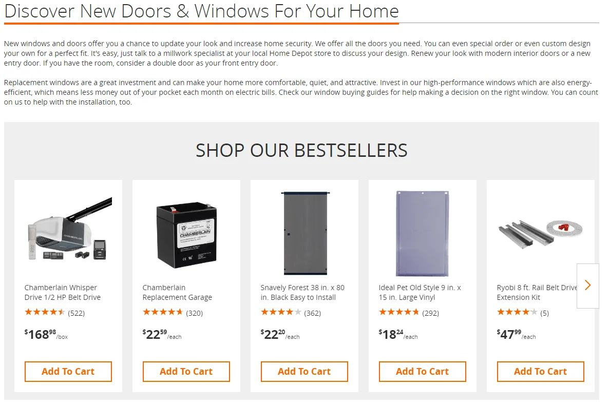
New Arrivals help brand supporters to make new purchases as they keep coming back for more. Prime Sellers is equally effective as it encourages new customers to make their first purchase based on your popular products.
Read this next:
Product Videos Ecommerce: Why Most Brands Get It Wrong
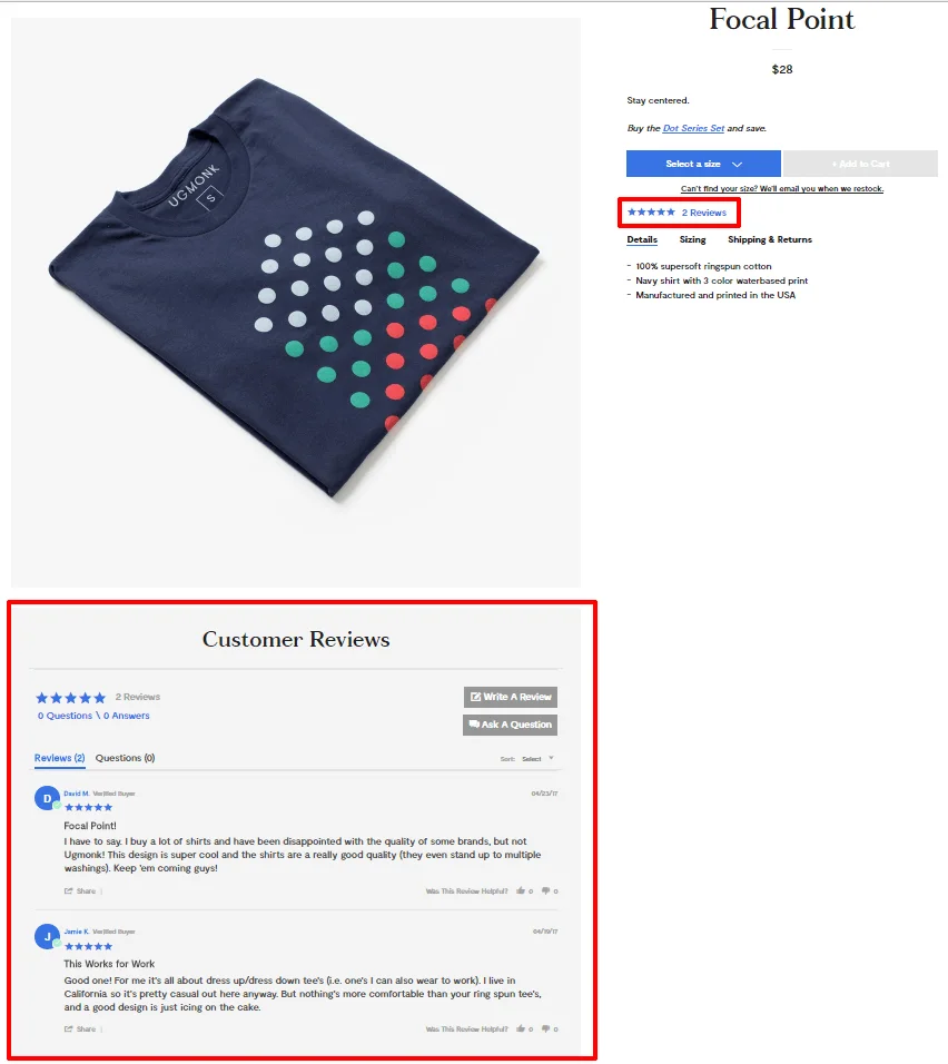
Product page leading practice tip #9: Display customer ratings and reviews
High converting product pages won’t do their job without the following elements:
Product page leading practice tip #10: Compelling product copy
According to Moz, 67% of consumers are influenced by online reviews. Displaying all kinds of reviews, good and bad (yes, the negative ones, too) encourage consumers to trust your brand and purchase from you. Honest reviews are always a strong basis for trust.
Product page leading practice tip #11: Huge, vibrant product images
Product copy is an essential part of the eCommerce world. Why? Because it needs to sell the product. It needs to speak to the consumer. Be descriptive, paint pictures, and instead of stating features, explain the benefits of the product.
Visuals trump text. A grainy, pixilated image with dull colors will paint a negative picture of your brand and not appeal to your consumer. On the other hand, a large, vibrant picture where every single detail is clearly visible will appeal more to your customers. Moreover, try to display as many angles and viewpoints of the product as possible.
According to Matt of American Muscle,
“American Muscle not only has a great collection of photos for almost every product from every angle, on and off the car, but also allows customers to upload their own pictures. These customer shots are often better than the corporate shots and include angles that customers really want to see.”
The ultimate guide to growing & scaling an eCommerce business
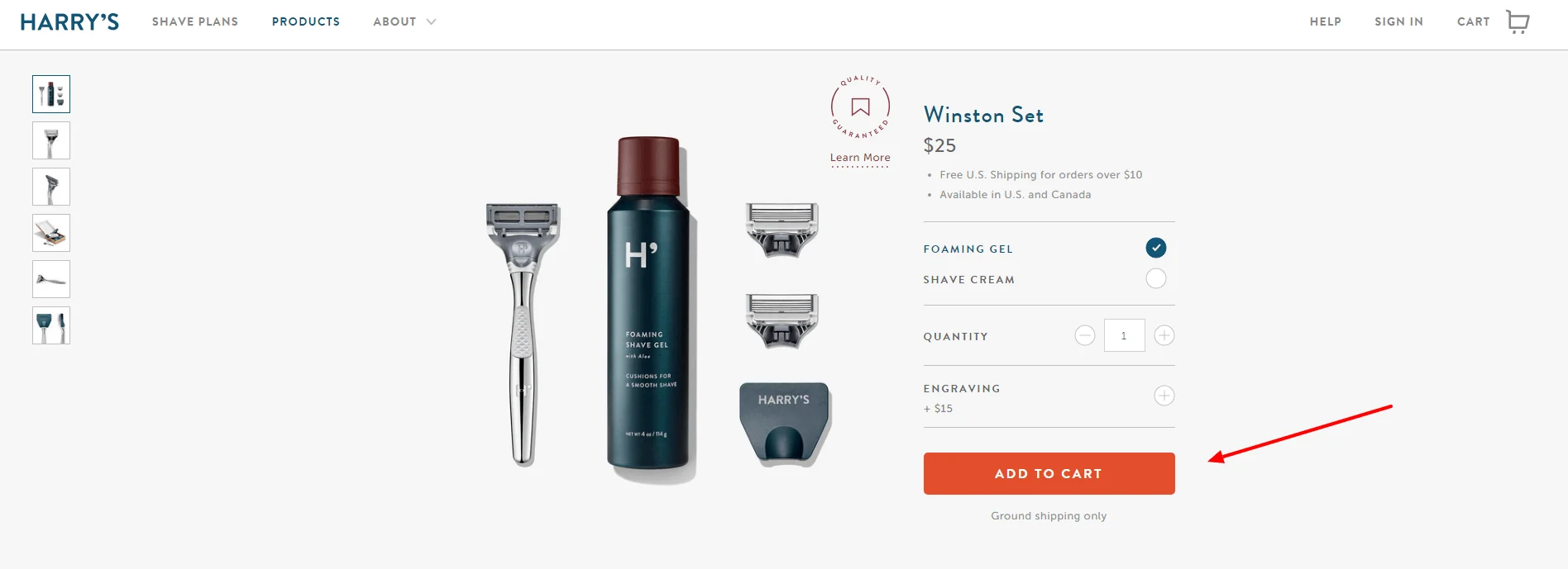
Product page leading practice tip #12: Big, bold, contrast-in-color add-to-cart buttons
Product page leading practice tip #13: Up-sells, cross-sells, related products
Place CTAs in close proximity to the product. Label the CTA button Add to Cart, Buy Now, etc. Make sure they’re large and easily visible.
You can boost your conversions and increase your average cart value by up-selling and cross-selling related products. Show consumers products that would complement their purchase or ones that are similar to what they’ve bought. According to a Forrester research, up-sells and cross-sells are responsible for an average of 10-30% of eCommerce revenues.
eCommerce Checkout Page Leading Practices
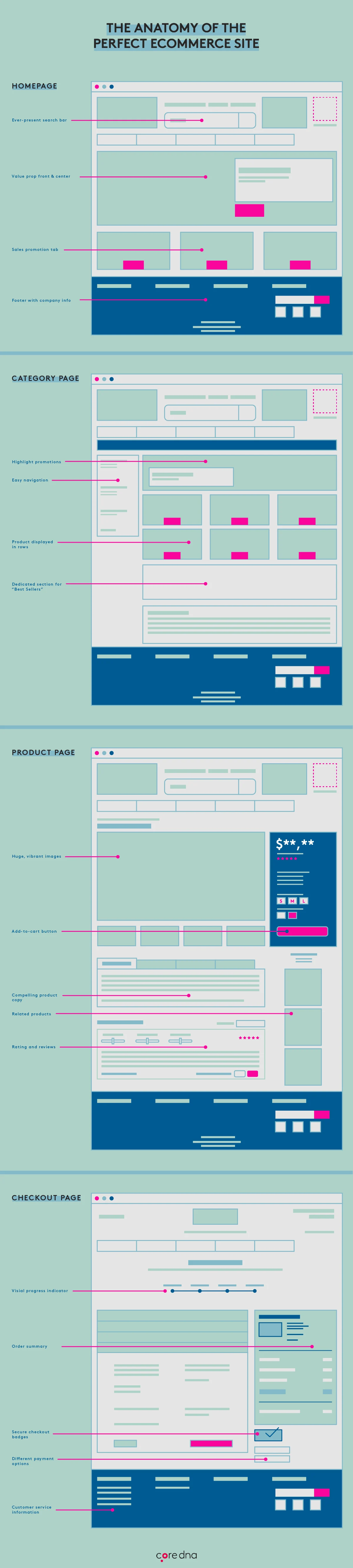
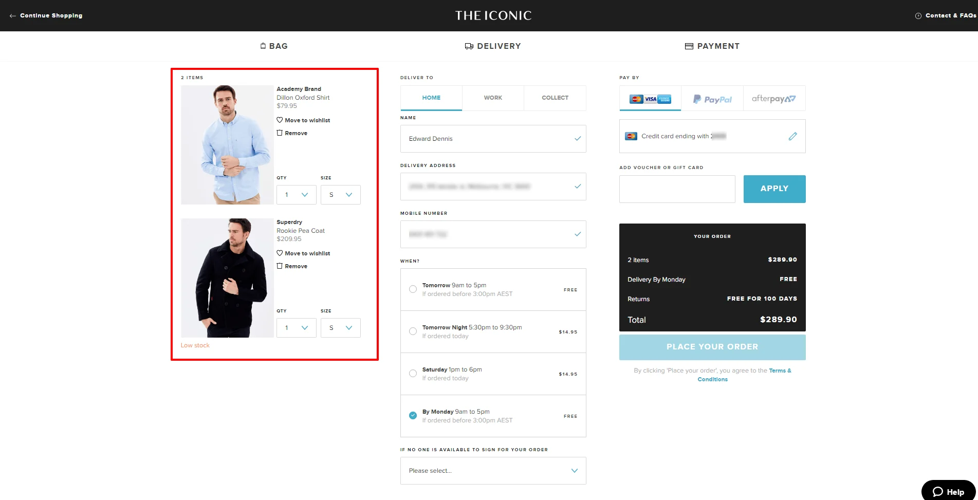
Checkout page leading practice tip #14: Visual progress indicator
The following elements give consumers that final push to complete a sale on the checkout page:
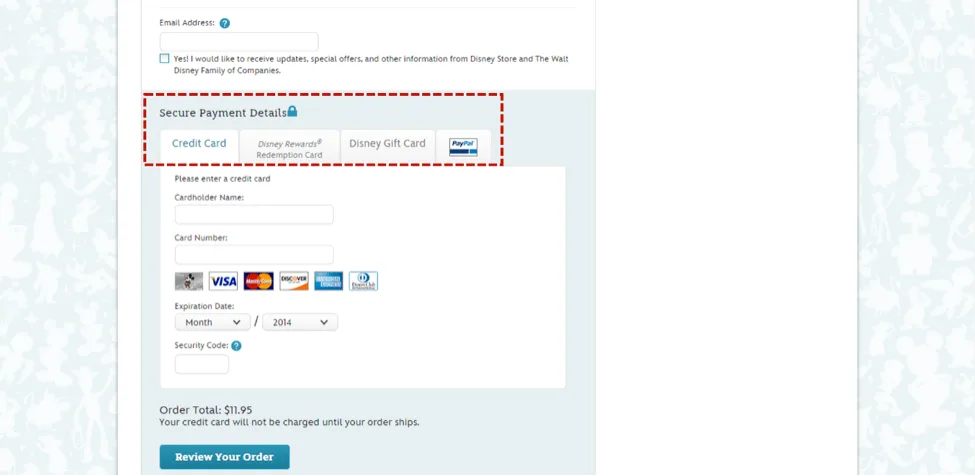
Checkout page leading practice tip #15: Offer different payment options
Online checkout forms can often dissuade customers from completing the shopping process. So close, yet so far. But why? Because filling out all of the painstaking details can be the most boring and manual task known to the digital world! So how do you make this painful task a little easier for your customer? Showing them their form-filling progress through a visual progress indicator lets them see the light at the end of the tunnel. It doesn’t do the job for them but at least psychologically its helping get them through it.
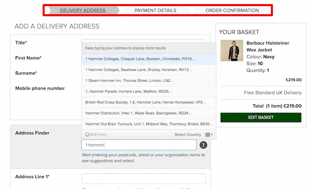
Checkout page leading practice tip #16: Include order summary
Offer customers the luxury of choosing their payment options such as PayPal, Stripe, Mastercard, etc.
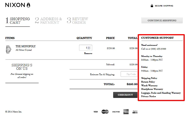
Checkout page leading practice tip #17: Easy-to-navigate customer service
Show your customers their order summary on the checkout page, so that they know what they’re purchasing. It keeps them from constantly wondering if they clicked on the right product, what the price was, did they choose the right color, etc. You can include the product picture, product attributes and its price.
Read this next:
B2B Pricing Strategies: What Works, What Fails & Why
Checkout page leading practice tip #18: Secure checkout badges
No return policy is a sure-fire way to scare your customers. To avoid this, add support elements to your checkout page. This can include a chat feature, clear shipping and return policies, a toll-free number for them to call, etc.
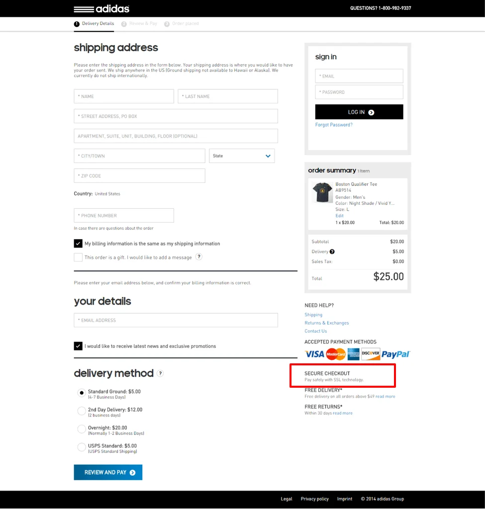
Use a header that says ‘100% secure shopping’, or add security badges at the footer to put your customers’ lingering security questions at rest. With eCommerce business booming at such a rapid pace, it’s important to provide customers with a secure online shopping environment. Adding this graphic on the checkout page will eliminate the chances of customers backing out at the last minute due to security concerns.
How to build the best eCommerce site
Want to see the full infographic? Feel free to share (embed code is at the bottom)
Share this infographic on your site
Prime eCommerce sites examples: 2025 edition
We researched the top eCommerce sites across various industries, in both B2C and B2B, to give you a comprehensive look at what it takes to go from an average site to an industry leader.
1. Stanley-PMI: First-impression matters
Category: B2C
Market: Outdoor mugs and thermoses
When someone lands on your site, they’ll leave in a heartbeat if you don’t engage them quickly or show them something that intrigues them.
So, it’s vital for your site visitor to understand the benefit of your products and Stanley-PMI does a great job of this. The quicker they can understand what your product does for them, the higher your conversions will be.
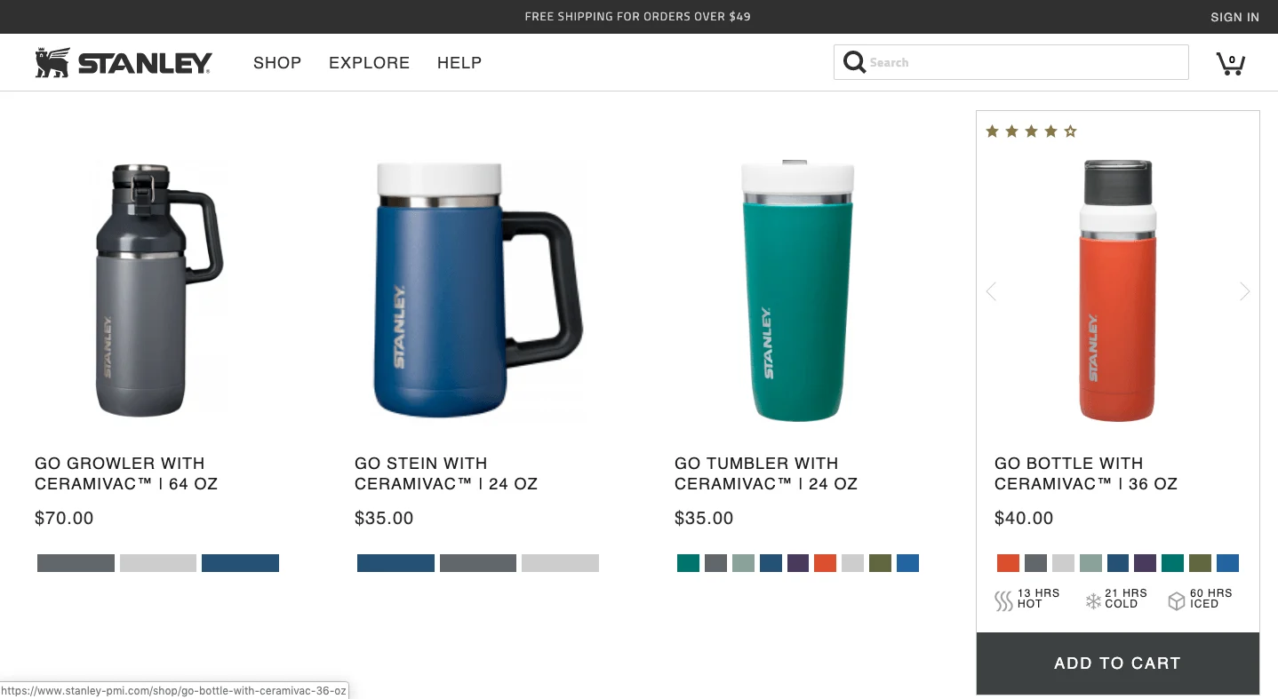
What we like about it
Clear and concise product copy: the quick bite of benefits, colorways on each product, rating on top, and a clear “ADD TO CART” button all make it easy to decide.
What could be improved
Instead of saying “Sign up to our newsletter”, they should state an immediate benefit to signing up. They could use a lead magnet and write something like, “To receive your free guide…”
Even adding “Sign up for exclusive deals” without a lead magnet would make it a bit more convincing for readers to enter their email.
Read this next:
How the Stanley Timeline Defies Marketing Logic
2. Tivoli Audio: Optimizing for “The ready-to-buy guy” & “The show me the details dude”
Category: B2C
Market: Audio
There are two types of consumers:
- Those who are ready to buy, make quick decisions, and want to get right to the goods.
- Then there are those who want to know more. They want to read the FAQ, the About Page, and read just about everything before they buy.
A good eCommerce site knows how to optimize for both types of people and Tivoli Audio does this well.
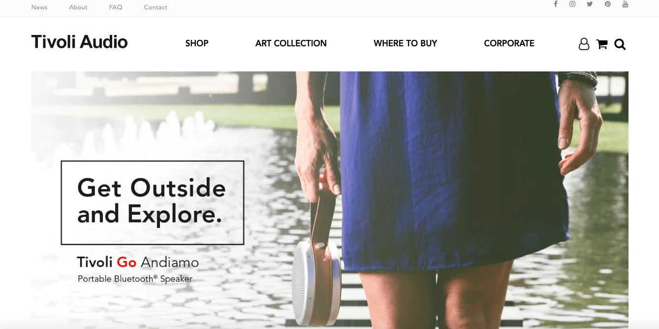
What we like about it
Double-header navigation on the home page. Large, clear navigation to the shop and other main pages, and for those who want more, you have the deeper details above.
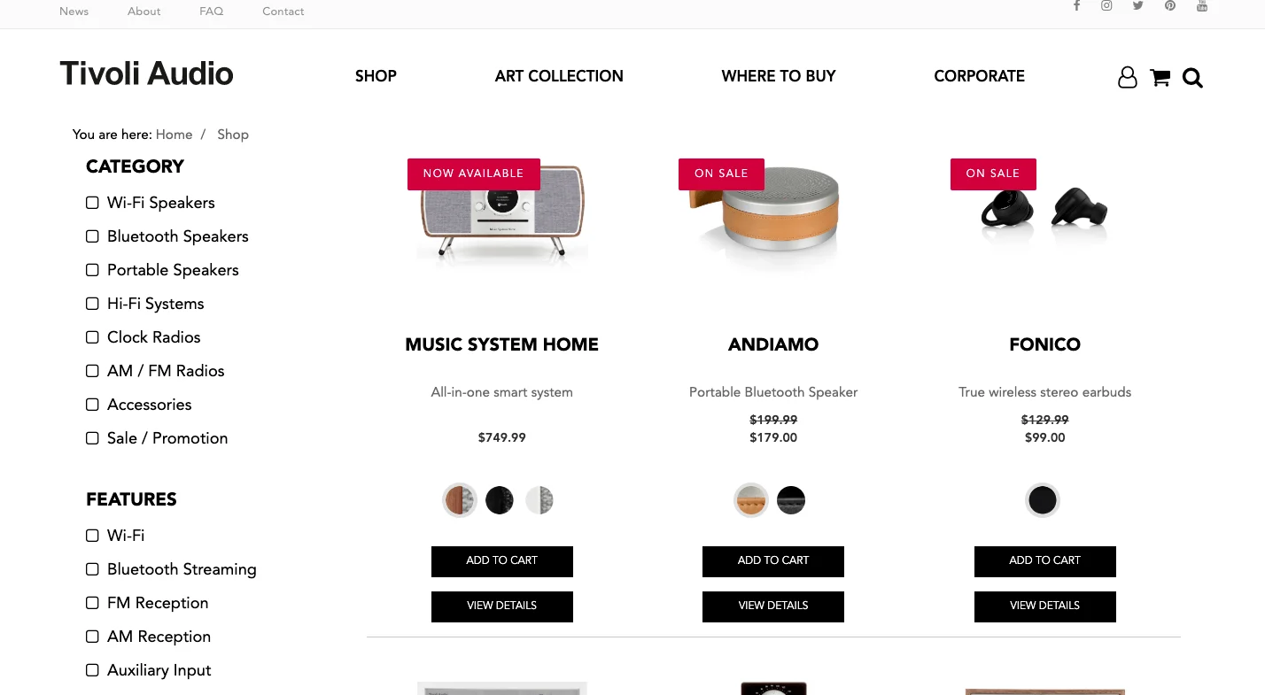
What could be improved
One category that should be added (as it’s usually the top category selected on eCommerce sites) is a “New Arrivals” category.
Read this next:
How the Stanley Timeline Defies Marketing Logic
3. Herman Miller: Showcasing their products
Category: B2B
Market: Furniture
Large, clear, vivid photos are expected these days. Video is becoming the new standard.
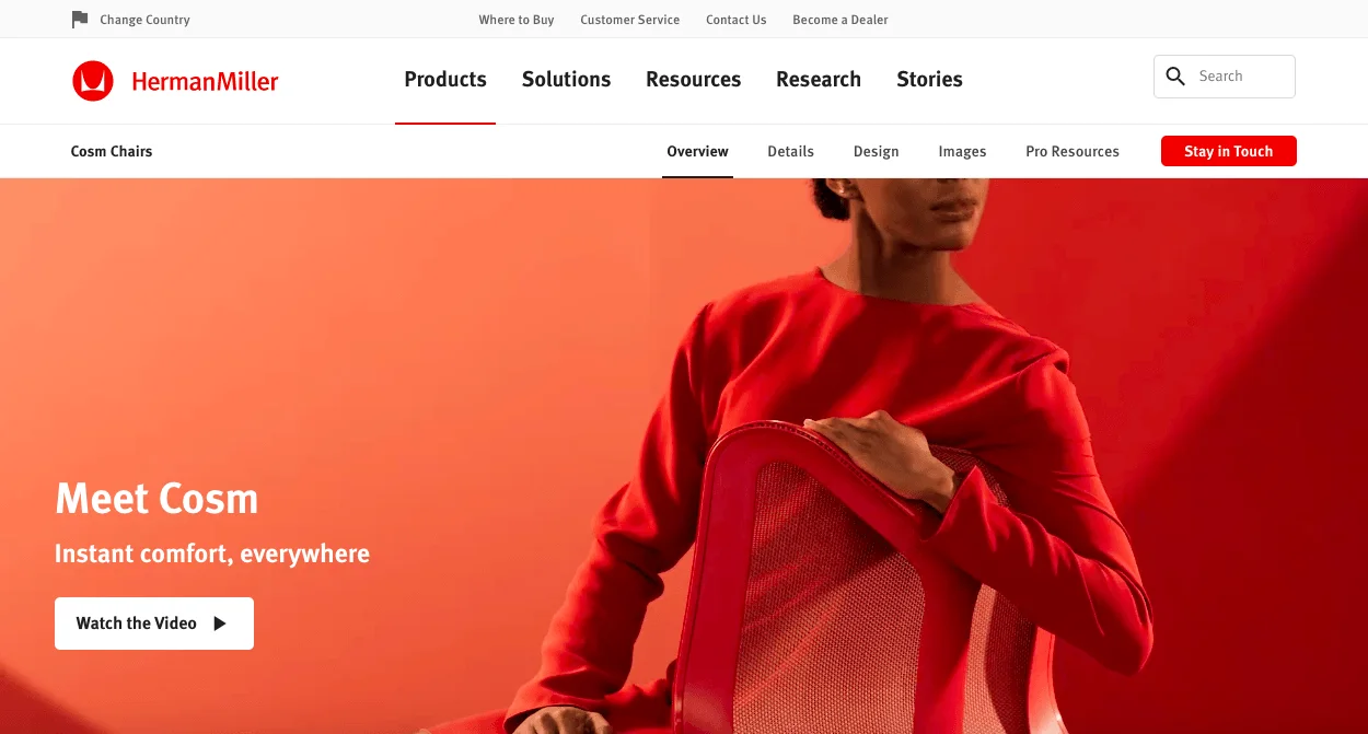
What we like about it
Products displayed by video - customers can experience products in motion, thus making them more likely to buy.
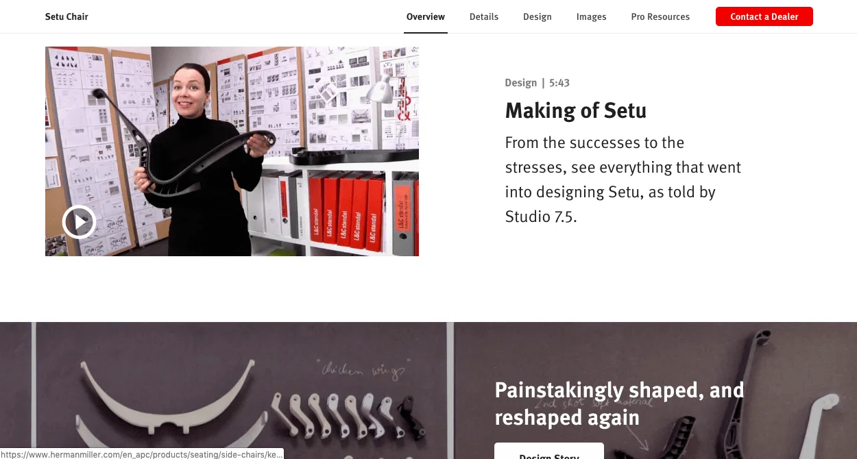
What could be improved
What’s missing on Herman Miller is the customers’ testimonials. There are no reviews on the site. There are several designers on product pages, but they’re missing the social proof.
4. Sticker Mule: Proving their value proposition, in seconds
Category: B2B
Market: Gift
Sticker mule does a great job of making it clear why they’re so good. Their value proposition is the first thing you see, and their prospect’s free sticker proof is made up in seconds, building trust and increasing conversions.
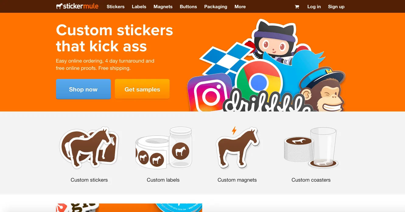
What we like about it
A very clear value proposition that’s proven in seconds, and social credibility.
What could be improved
There could be an easier way for customers to get in touch with customer service - there is only one “contact” button on the site at the bottom of the page.
Adding a live chat option in the bottom right would be great. Even adding a second “contact” button up top would help.
5. Lululemon Athletica: Getting their visitors to engage
Category: B2C
Market: Apparel
People want more interaction. They want to be more involved in the online shopping experience.
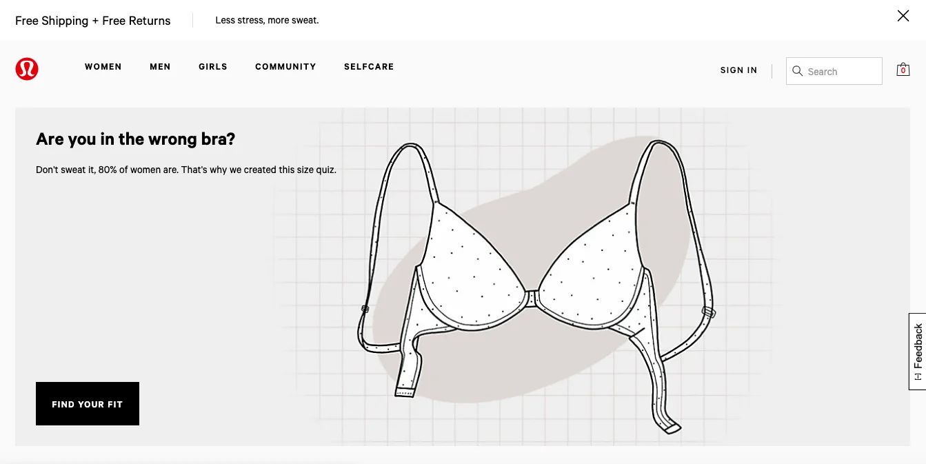
What we like about it
The engagement on the site is great, plus the navigation makes it easy to find exactly what you're looking for.
What could be improved
The live chat feature requires too much work - rather than having to fill out a form to wait for live chat, allow the customers to skip the work and start chatting right away with a customer service agent, or a chatbot.
Read this next:
The Hidden Cost of Poor Ecommerce User Experience
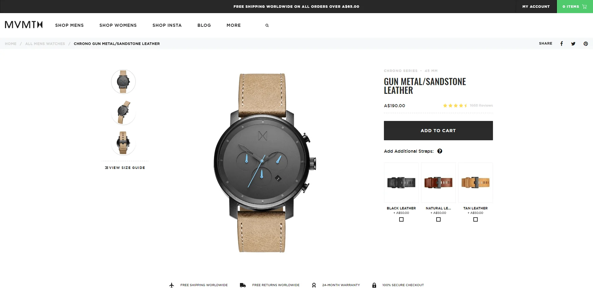
6. MVMT: A one-click upsell to increase AOV
Category: B2C
Market: Fashion
Your eCommerce store should be designed to do one thing: give your customers something they want.
An upsell is a perfect opportunity to add a bit more value to your current offer. If you can make it as easy as clicking a button to add a second strap to a watch, you’ll be able to up your average order value big time.
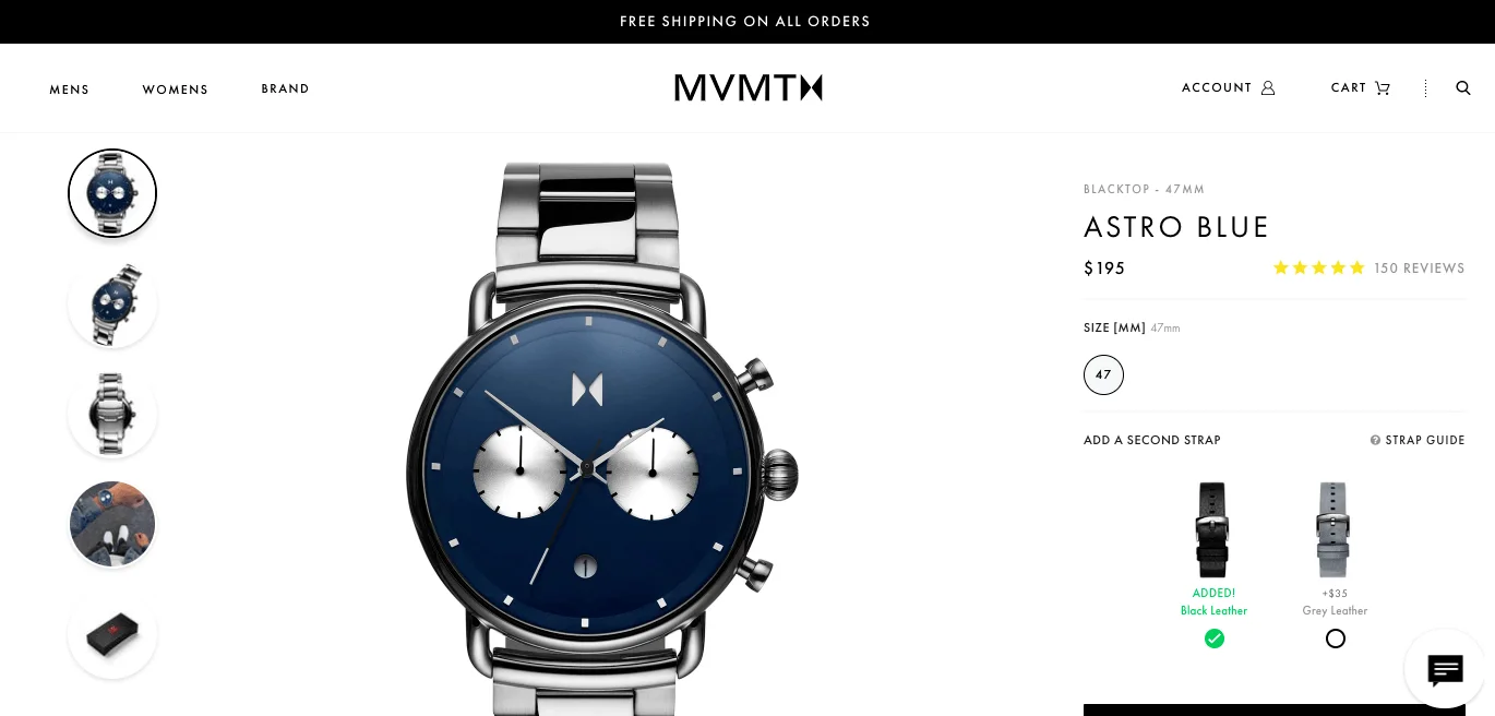
What we like about it
MVMT’s upsell on their watches doesn’t come across as pushy. It doesn’t make you feel uncomfortable. It creates an opportunity for their visitor to have more options. Put yourself in your visitor’s shoes. “Hmm… second strap… I never thought of that. Having black leather would be nice. Yeah, I like that one better than grey.” *Click*
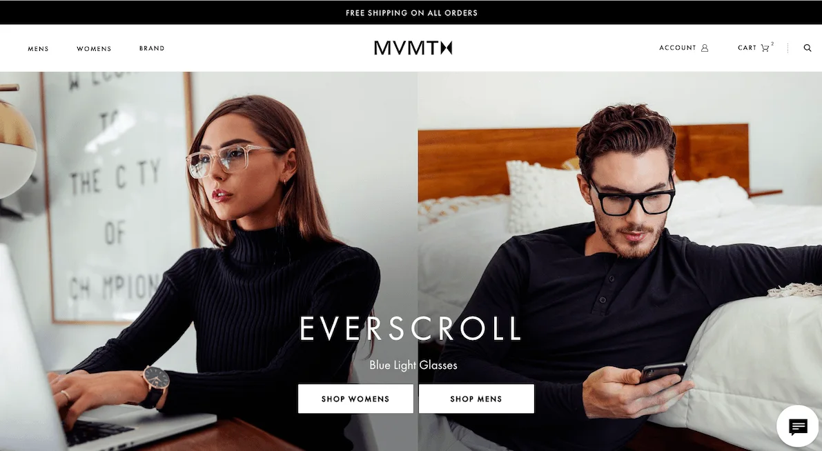
What could be improved
MVMT has a pretty site. It’s clean, it’s designed well. It’s easy to use. However, one thing that could be improved is the home page above the fold. A clear value proposition that immediately tells you why your store is different will lower bounce rates and increase conversions.
Read this next:
Ecommerce Facebook Ads: Why Most Brands Get It Wrong
Have questions? Speak with our experts to find your ideal content solution
Summarize with


