Top eCommerce Website Design Trends to Boost Sales

Summarize with
Ecommerce website design should be a the core of your eCommerce strategy. Designing an eCommerce website isn’t just about aesthetics—it's about creating a seamless, engaging shopping experience. The latest trends in eCommerce website design go beyond visuals, focusing on user experience and conversion optimization.
A dull ecommerce website will cost your business. Customers will abandon carts for the smallest things no guest checkout, no having different payment methods or unexpected shipping fees.
In this article, we share the best principles of eCommerce UI/UX design ideas and emerging trends. This tips will help increase engagement and conversion and make your ecommerce website design the best in the business. Read on…
Key takeaways
- UX Drives Sales: A clean, intuitive design with easy navigation, responsive mobile layout, and clear calls-to-action boosts engagement and conversions.
- Prioritize Trust: Incorporating secure payment methods, visible reviews, clear return policies, and security badges greatly increases customer trust and checkout completion.
- SEO Optimization is Critical: Optimized images, schema markup, descriptive URLs, alt texts, internal linking, and unique content enhance discoverability and drive organic traffic.
- Embrace Emerging Trends: AI-driven personalization, AR for immersive experiences, voice search optimization, eco-friendly practices, dark mode, and headless commerce are shaping the future of effective eCommerce design.
On this page:
eCommerce Website Design Tips – The Keys to Success
No matter what you’re selling, the design of your ecommerce website matters. More than looking attractive, your website needs to be intuitive. Engagement and conversions don’t need a hard push when your ecommerce website looks professional and trustworthy.
Choosing the Right Typography and Readability
Pay attention to the font of your ecommerce website. While often overlooked, your chosen typography dictates how users interact with your site. For instance, any fonts that you choose need to be readable and accessible on a variety of devices and screen sizes.
Mobile-friendly ecommerce design is crucial. Remain accountable and avoid messy and an unprofessional-looking ecommerce website by creating guidelines.
Current best practice in ecommerce website design is to use just two or three fonts. Doing so will prevent your ecommerce website from looking too busy and making it difficult for users to decipher key information and messaging.
Again, creating hierarchical guidelines for your headings, subheadings and body text will ensure a clean and professional look. You can checkout here 20 stunning typography examples in eCommerce.
Choose Color Schemes Wisely
To continue a professional approach to your ecommerce website design, consider your use of color. Incorporate color schemes used in your branding and logos. The use of your brand colors will help customers to recognize your products and build trust.
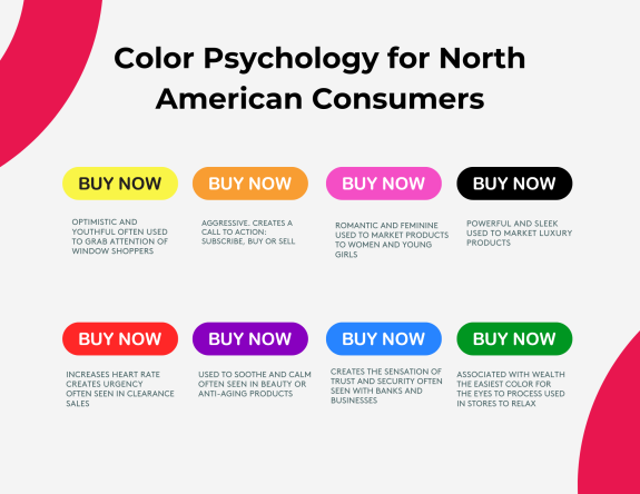
Interestingly, contrasting colors are particularly useful for calls to action. Keeping a neutral background but adding a bright orange or vibrant green can make all the difference for conversions and click-throughs.
Keep in mind to check out color psychology in eCommerce as it has proven impact on actions and behavior. Use colors that trigger an good emotional response from your customers to increase conversion and actions.
Don’t Waste the Whitespace
Don’t fill every bit of space on a page. Rather than looking bare, whitespace is something of an unsung hero. Also known as negative space, whitespace has so many positives.
By keeping a page clear and readable your eCommerce website portrays a professional and clean look. Key content such as images, videos, calls to action and messaging stand out and get to work.
Honor Your Branding
We’ve already mentioned that your eCommerce website design needs to honor your branding and logo. Psychologically, users will build connection and trust to sites that adopts a consistent approach to color, typography, and use of logos. Going one step further, you need to use a tone of voice and apply language that is true to your brand.
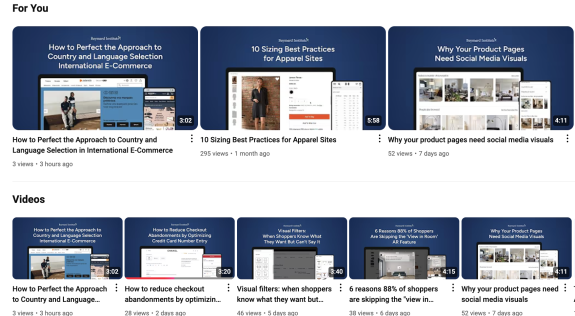
For the most detailed eCommerce UX and UI researched head to the Baymard Institute. A gold mine of content for eCommerce stores and how to optimize UX and UI for the best outcomes.
Your Ecommerce Website Looks the Part. But Does it Have Functional Features?
We’ve discussed what makes a successful ecommerce design, but what else does your site need?
A high-functioning ecommerce website that meets the needs of your users by creating a seamless shopping experience is a must. A responsive ecommerce design should be usable but also look and feel professional, which in turn boosts trust, conversions, and sales.
What are the functional features must-haves? Let’s take a look…
Fit for Mobile
Over half of all web traffic comes from a mobile device. Therefore, a one-size-fits-all approach does not work. Instead, having an ecommerce website that automatically adapts to different screen sizes (think smartphones, iPads, tablets, laptops, and desktops) can be the difference between keeping a customer on your site or not. Additionally, your Google search engine ranking will be significantly impacted if your site is not a mobile-friendly ecommerce site.
Adopt User-Experience eCommerce Website Navigation
Any visitor to your site will appreciate clear user experience ecommerce navigation. Using neat and clutter-free menus with defined categories glues visitors to your site.
Sticky headers and dropdown menus are nice touches when it comes to easy navigation. The addition of subcategories and breadcrumbs also gets a big tick.
Tip: We recommend putting your site to the test. Carry out regular usability testing to ensure your ecommerce website is delivering.
Easy-to-Use Search Functionality
There’s nothing more frustrating than searching for a search bar! Boost your site’s search function by adding.
- Auto Suggestions: As a user types the potential answer will appear.
- Option to Filter and Size: Help users narrow down their choices by size, color, category, and type.
- Offer Alternatives: Create helpful suggestions when a match is unavailable or not found.
YMCA of Greater Toronto was able to increase their registrations by 500% after implementing elastic search and redesigning their camp selection process.
Incorporate Secure Payment Gateways
Any online shopper will want to know that their purchases are on secure ecommerce websites. By using PayPal, Stripe or Apple Pay you are reassuring visitors that their purchases are safe. Added security comes by displaying SSL certificates and PCI compliance seals.
As well as secure payment gateways, it’s advisable to offer a range of payment options such as credit/debit cards, digital wallets and PayPal.
Optimize Loading Speeds
Shoppers don’t love lag. The best way to ensure your page loading times are super-fast is to optimize images, use caching techniques and a Content Delivery Network (CDN). Optimization will improve your site’s speed and performance as well as deliver better user experience and SEO.
You can read here about how Core dna managed Taylor Swift Eras Tour tickets sales in Australia and the different protocols put in place to manage the surge in traffic.

Your Ecommerce Website Looks the Part. But Does it Have Functional Features?
A Shopping Cart That Delivers
A persistent cart displays any selected items, even if the visitor leaves your site and closes their browser. Having the item(s) sitting in the cart on their return is a user experience eCommerce goal.
How to Build Trust
Help to build trust by incorporating the following in your ecommerce website:
- Reviews and Ratings: Put your customer reviews in a prominent position.
- Display Your Return and Refund Policies: Be upfront about your return and refund policies.
- Contact Details: Provide clear contact information so that your customers can email, call, and take part in live chat.
SEO for the Best in ecommerce Design
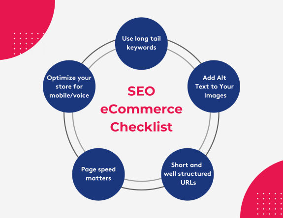
Best practice in ecommerce website design involves search engine optimization. By using effective SEO practices, you make it easier for visitors to find your store and products within. Follow these best practice SEO strategies:
Use long tail Keywords
Make your page navigable and discoverable by using unique and descriptive titles and meta descriptions that include target keywords. Rather than use generic keywords such as ‘Pink Socks’ add more specific details such as ‘Ladies pink knee-high socks with rib pattern.’ The addition of long-tail keywords will also help when it comes to niche searches and ranking.
Always add Alt Text to Your Images
Images that aren’t optimized slow down your site. Best practice is to compress all high-quality images which will in turn retain fast loading speeds. It is also best practice for website accessibility and search engine context to include descriptions in the alt text field.
For example: "Ladies’ cotton pink socks with ribbed pattern."
Optimize your URL and add internal links
Help users to navigate your site by using internal links. An example would be linking to related product pages and relevant posts and articles. Use phrases such as “you might also like” or “shoppers who bought this product also bought …”
Also make sure your url is optimized, short and easy to read as this Neil Patel example:
POOR EXAMPLE: https://www.example.com/article-for-baking
GOOD EXAMPLE: https://www.example.com/baking-articles/
Adopt Schema Markup
Make your site as search engine friendly as possible. Using Schema markup provides search engines with information on product ratings, availability, and pricing. Your data will appear as rich snippets in search results which will, fingers crossed, lead to more click-throughs.
Don’t Forget About Mobile-Friendly eCommerce Site Optimization
Google mobile-first indexing insists on your site being fully mobile optimized. Therefore, your mobile-friendly ecommerce site needs to be responsive and have easy navigation. Remember, small can be beautiful and optimized.
Site Speed Matters
A slow-loading page will harm user experience and how your ecommerce website ranks in terms of SEO. We recommend using Google PageSpeed Insights to analyse your website and highlight any performance issues. Other optimization techniques to improve load times include caching, using a CDN and minimizing JavaScript.
Create Unique Content
Tempting as it might be, duplicate content does nobody any favors. Start as you mean to go on by adopting SEO for ecommerce websites' best practice by writing unique product descriptions. This also goes for any blog posts, FAQs, and how-to guides.
A visitor is more likely to become a loyal customer when they know there is a human behind the site.
What are the Future Trends in Ecommerce Website Design?
Ever evolving, the advancement of ecommerce website design is not slowing down. Here are the new trends to look out for and use.
Artificial Intelligence (AI) and Machine Learning
The personalized shopping experience has gone up a notch. Thanks to AI, customers can now receive specific and tailored product recommendations. Whereas for the ecommerce website owner, AI will use analytics to predict customers’ needs.
With AI chatbots assisting customers around the clock, it also reduces overheads. One such tool is LivePerson which, despite its name, uses AI to create conversational shopping experiences.
The World of Augmented Reality (AR)
Want to know what a new sofa will look like in your home? Welcome to AR. The advancement in AR onto ecommerce websites allows visitors to visualise potential purchases in their environment or, on their body!
AR is particularly useful for fashion and beauty and interior and garden design. Stores like IKEA and Sephora are already using AR on their websites and it won’t be long before more follow suit.
Using Voice Search Optimization
First, it was Alexa and Google Assistant. Now ecommerce websites are walking the talk with voice search optimization. As voice queries tend to be longer than a written version, ecommerce sites need to consider using conversation keywords and structured data to ensure they appear in searches and do well in the rankings.
A Nod to Sustainability and Eco-Friendly Design
Customers appreciate organisations that care about the planet. Environmentally conscious design elements such as reduced data, carbon-neutral shipping and compostable packaging speak volumes.
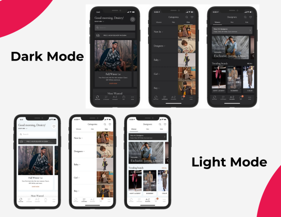
Employ Dark Mode Design
Giving users the option to customize their site experience through dark mode is becoming increasingly popular. Using dark mode not only looks sleek, but it reduces eye strain.
Go 360, Use Immersive Content Experiences
360-degree product views and video demonstrations offer interactive and immersive experiences for your customers.
Use Headless Commerce – Responsive Ecommerce Design
Responsive ecommerce design is best practice. You know by now that scalability and flexibility are your friends when it comes to ecommerce website design. Headless commerce separates the front end from the backend and by doing so a business can create unique customer experiences for web, mobile apps, and IoT devices.
Keep abreast of future ecommerce design trends and be prepared to flex so that your customers get the best possible experience. You can also take a look at the eCommerce trends shaping the future of online retail here.
eCommerce Website Examples: Who’s Doing it Well?
It pays to do your research. Let’s take a look at some ecommerce website examples to discover the best in ecommerce website design…
Framebridge
Framebridge has been gaining popularity in the past year for its simple offering and exceptional service. It was able to create an extremely fluid experience with their online store earning them the status of "best online service of 2023" by Spruce.
The design agency explains how they created highly converting pages by leaning into the emotional aspect of framing memories "With rich, immersive product pages that allow customers to preview their cherished items in any frame."
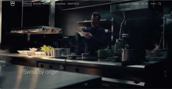
Vzug: The excellence online
The Vzug website is powered by Core dna and built to convey excellence and minimalism online aligning with their commitment to minimalist Swiss design. Vzug puts a lot of effort into creating household products that are both intelligent and intuitive and they want their customers to experience their products online and on site.
The website portrays a clean and uncluttered layout with intuitive and clear navigation. The website is optimized for various devices, providing a seamless experience across desktop, tablet, or mobile.
Overall, the V-ZUG website's UX and UI reflect the company's dedication to delivering high-quality, user-friendly experiences that embody the essence of Swiss design—functional, elegant, and enduring.
Best Ecommerce Website Design Checklist
Use this checklist to ensure that your ecommerce website is ticking all the boxes.
Site-Wide Design Checklist
1. Responsiveness: Does your site function seamlessly on different devices? It’s not enough to have a one-size-fits-all approach as your ecommerce website needs to look and work on a mobile and tablet. Not sure? Carry out usability tests.
2. Loading Speed: Optimize images, allow caching, and use a CDN. Employing these three elements will speed up page loading times.
3. Secure Ecommerce Websites: Customers need to trust you. By displaying SSL certificates and security badges you reassure your visitors that their details are secure.
4. Prominent Cart: Make buying as easy as possible by displaying a shopping cart on every page. You get extra marks for the cart being in the top right-hand corner with a preview of items selected.
5. Search Bar: A search bar should appear at the top of every page. Add user suggestions for an enhanced user experience.
6. Navigation Menus: Categorize intuitively and with breadcrumbs for easy website navigation.
Homepage Checklist
7. Hero Image: High-quality visual(s) that speak of your brand, mission and products are crucial.
8. Featured Products: Highlight special offers, best sellers and one-off items.
9. Strong CTAs: Use CTAs to draw in sales. “Shop Now” or “Learn More” will encourage engagement.
10. Engaging Photography: Use natural lifestyle images to help customers envision their relationship with your product.
11. Proof: Show why your business is trusted through testimonials, reviews, media mentions and case studies.
Stock Checklist
12. Category breakdowns: Categorize products in a logical order with a high-quality hero image.
13. Product Availability: Display stock levels to aid shopper buying (and to create a sense of FOMO).
14. Filters and Sorting: Allow users to filter products by size, color, price, and type. The more filters the more helpful.
15. Customer Highlights and Recommendations: Showcase best-selling and highly rated products.
Product Page Checklist
16. “Buy Now” Button: A visible ‘Buy Now’ or ‘Add to Cart’ button is essential. Make sure it leaps off your page.
17. Product Descriptions: Concise and unique product descriptions highlight the benefits and key features.
18. Imagery: Display several high-quality images (optimized of course) showing different angles, uses and, in the case of clothes, with people of different sizes. Include a zoom feature.
19. Videos: Bring your products to life with videos.
20. Reviews and feedback: Provide social proof through the prominent display of ratings, reviews, and customer feedback.
Shopping Cart Checklist
21. Transparent Pricing: Be upfront about all fees including shipping and taxes.
22. Editable Cart: Ensure users can alter quantity numbers or entirely remove items directly from the cart.
23.“Returns” Link: Show your policy and how users can make returns.
24. Delivery: Offer and display a variety of shipping choices from expedited to free. Include delivery times.
Checkout Checklist
25. Simplified Process: Keep the checkout process as simple as possible with no more than 3 or 4 steps.
26. Checkout as Guest: Avoid cart abandonment by allowing customers to purchase as a guest.
27. Payment Options: Display the range of payment options including credit cards, PayPal, and digital wallets.
28. Security Seals: Display security badges. These reassure users that their financial and personal details are in safe hands.
Company Information Checklist
29. Contact: Show customers how they can reach you. Include options for phone, email, live chat, and feedback forms.
30. Returns: Show how easy it is to return items by displaying your policy.
31. Privacy: Be transparent with your privacy policy.
32. Support: Include FAQs and links to your chatbot and feedback forms.
Final Conversion Methods
33. Upselling: Include wording such as “You may also like” or “shoppers who bought this item also bought...”
34. Wishlist: Encourage customers to create a wishlist. Make the wishlist shareable.
35. Delivery Times: Give a clear idea of estimated delivery dates and times. During peak holidays and sales season, delivery date can be used as an incentive to purchase.
36. Post-Purchase Sweetener: Offer discounts on future purchases in exchange for reviews and feedback.
To be a success, your ecommerce website needs to not only look good but to cater to the user.
Our best Ecommerce website design tips include using easy navigation, high-quality imagery, categorized filters and the inclusion of AI and AR elements. A well-designed ecommerce site makes shopping effortless and builds trust, boosts engagement, and drives conversions.
Remember, displaying feedback, reviews and ratings alongside security badges and returns policies is both reassuring and trust-building.
Finally, using SEO for ecommerce websites’ best practices will ensure your website operates at peak performance and pays you back in terms of its all-important ranking.
36-point checklist: Keep ahead of the crowd and keep your customers engaged and satisfied with our ecommerce website design checklist.
Whether for a new or existing site, this guide will ensure your ecommerce website is designed or redesigned following the latest in user-centric best practice design principles.


