
10 Web Design Mistakes Even Professionals Are Guilty Of
Summarize with
In a hurry? Get Headless CMS
Web design is an art, and it’s surprisingly easy to mess it up.
A small mistake is more than enough to make a great looking, award-worthy site into an urgh-I’m-never-visiting-this-site-ever-again moment.
And it’s the same mistakes we see time and time again; even the pros are guilty of making them sometimes.
Read on to see some of the most common and the most cringe-worthy web design mistakes so you can avoid making them yourself…
On this page:
Web Design Mistake #1: Disabling Zoom on Mobile Sites
This isn’t just cringe-inducing, this is headache-inducing… literally!
If you visit a website on your mobile that you want to read, then it’s rather irritating to find that you can’t zoom in to make the text large enough.
The result is that your visitors are left squinting at a tiny block of text and more often than not they’ll just leave.
Remember: there are now more mobile web users than desktop web users. Your site absolutely must be optimized for mobile in this day and age!
Read this next:
Top eCommerce Website Design Trends to Boost Sales
Web Design Mistake #2: Pop-Overs/Pop-Ups
Look:
Don’t get us wrong, pop-overs are OKAY. It’s the ‘when’ for pop-over displays that can be a mistake
A lot of websites these days make the pop-overs ‘pop’ as soon as you arrive on the page.
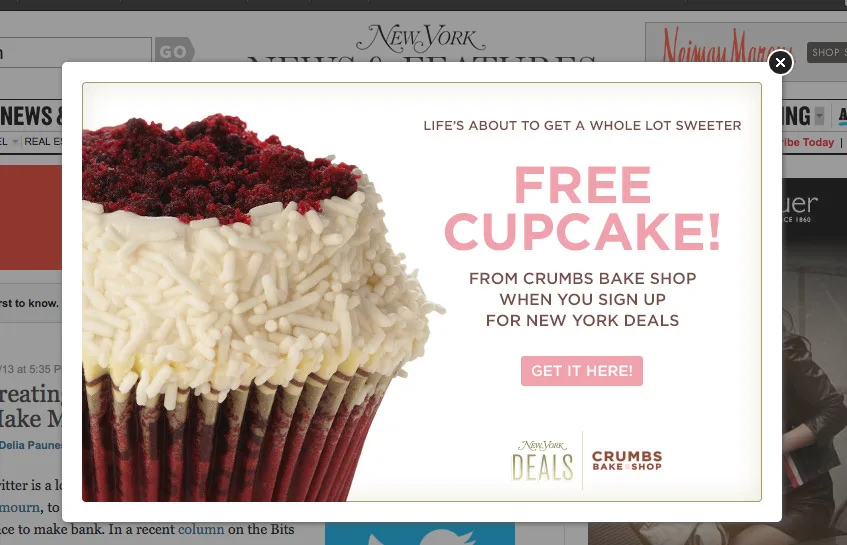
Why would someone want to sign up to your mailing list if they haven’t even read one word written by you yet? The whole point of content marketing is to show how you can deliver value and then to try and get people to subscribe.
It has its benefits. There’s no denying that. But consider preventing the box from showing until visitors have been on the page for a couple of minutes.
There is one thing worse than an early pop-up.
The worst kind is the non-mobile-friendly one. Your user is literally stuck looking at the pop-over, and the ‘x’ button doesn’t work. Don’t let this happen!
Web Design Mistake #3: Auto playing Videos With Sound
If you have a video embedded on your website then turn auto play off. Or at the very least, remove the sound.
While you might think that blaring sound out at people as soon as they load your page is a good way to get attention, it’s actually a much better way to get your site closed immediately.
Most people browse multiple sites at once and when they hear the noise, they’ll just look for the one with the sound icon next to it and hit ‘close’. A lot of people also like listening to their own music while they browse, so they won’t hear your video properly anyway, and it will just come out as a garbled mess.
Web Design Mistake #4: Light Grey Text on White Backgrounds
Serious question, why would someone do this?
It seems like an obvious no-no and yet you see it time and time again.
Sure, white is a great color and is any web designer’s best friend for creating space and giving a site a minimal feeling.
And sure, light grey is a nice gentle color with a modern feeling…
But that doesn’t mean that you should be combining both for your text.
Readable text is all about contrast so make sure that the color of the font is significantly different to the color of the background!
Web Design Mistake #5: Tiny Text
Likewise, it’s just as bad to use tiny text.
The problem here is that some web designers forget about the importance of their font altogether and thus just go with whatever default is.
You want users to feel that your site is a joy to read, filled with modern typography. You don't want them to get a headache searching through lots of tiny paragraphs.
Pro tip: The standard for body copy is 16 pixels. Anything less than that is hard to read.
Web Design Mistake #6: Scroll-jacking
Scroll-jacking is something of a dirty word among web designers and rightly so.
This is the process of essentially ‘hijacking’ the scroll bar on a website and turning a page of normal content into a series of slides.
If you’ve ever been to a website that does this, then likely you’ll know just how irritating it is and worst of all, it prevents you from skim reading, meaning you need to wait while each ‘slide’ loads.
At least give the option to ‘view as list’.
Of course, some webmasters like this design because it means they can fit more adverts in. Which brings us to the next point…
Web Design Mistake #7: Presenting Too Many Advertisements
Adverts make money, yes; but they also distract from your content and undermine your design.
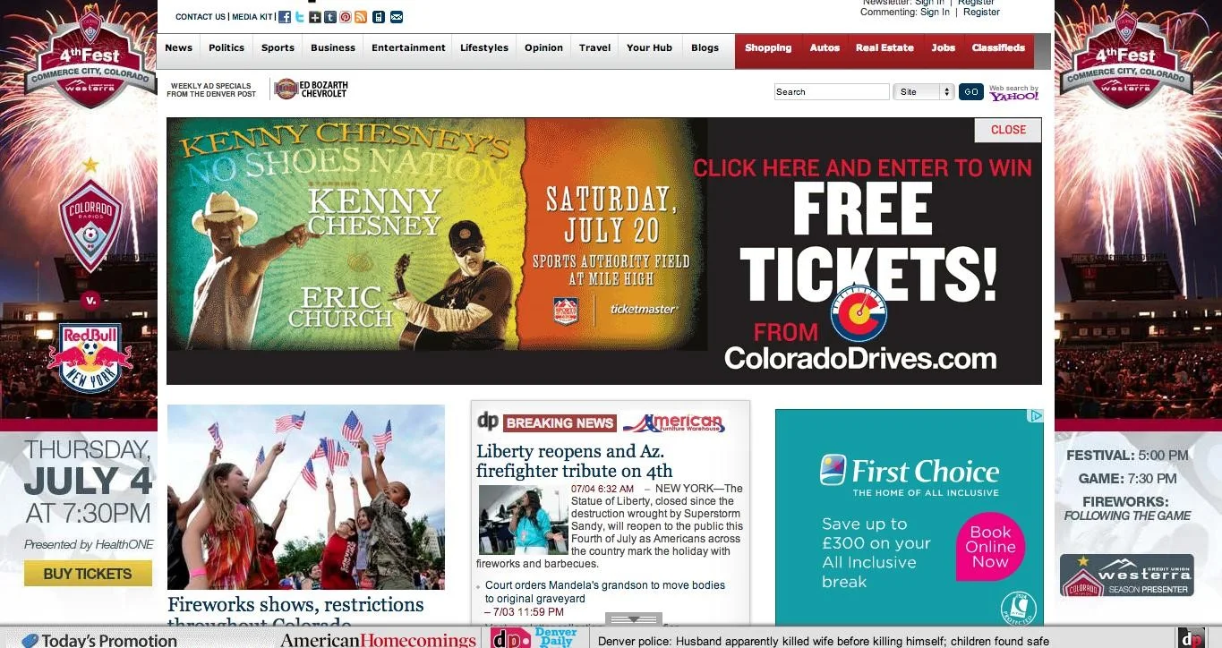
If you have too many on the page, they’ll all be flashing and trying to get your readers to look at them. The result is a sensory overload that causes confusion and ultimately increases your bounce rates.
Web Design Mistake #8: Drop Down Menus That Aren’t Touch-Friendly
We’ve already touched on how important it is to ensure that a website is mobile friendly.
And this is even more important when you consider that these days, many people interact with their PCs via touchscreens as well.
Creating a drop-down menu that requires a mouse-over to operate isn't a mistake confined to small-fry web designers.
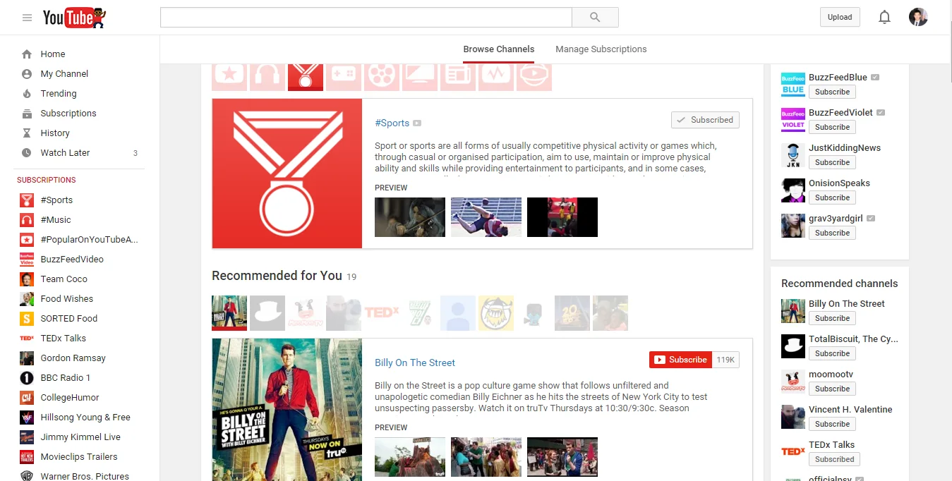
That’s right: this is a faux pas that YouTube is guilty of. If you try to browse through your list of subscriptions, you’ll need to move your mouse over the button then hover it over the list to scroll.
Web Design Mistake #9: Too Many Big Images
If your page has too many large images, it can be slow to load and slow to scroll.
If it comes down to featuring yet another massive image or letting your site load and run faster, then go for the latter.
Otherwise, people won’t want to go there because they won’t have the patience!
eCommerce website design best practices
Web Design Mistake #10: Missing the Small Details
Does it really matter if one item is slightly out of line in your menu?
Yes, it does.
These little details are the exact sort of things that no one necessarily notices but that together have a big impact on a site’s professionalism and appeal.
The devil really is in the detail so take those extra few minutes to look a little more closely and to give your site the extra polish that it deserves.
What are your own web design pet-peeves? Let us know @coredna
P.S. If you’re looking for an advantage when it comes to getting clients on board, schedule a demo with the team at Coredna and see how we can help your agency deploy quicker, with better security, and hassle-free maintenance.
Have questions? Speak with our experts to find your ideal content solution
Summarize with


